Monday, March 02, 2009

User Test[Lamsoon-Redesign] (WD-2)


Instructions:For every statement below, please give a rating from 1 to 5.
(1)- Strongly disagree
(2)- Disagree
(3)- Neutral
(4)- Agree
(5)- Strongly Agree
+ add your own comments if you want to.You can copy and paste this in the comments section and then just add 1, 2, 3, 4, or 5 at the end of each sentence. The comment section will pop up so you can always refer back here.
1. The homepage is attractive.
2. The overall's site is attractive.
3. The site's graphics are pleasing.
4. The site has a good balance of graphics versus text.
5. The colors used throughout the site are attractive.
6. The typography (lettering, headings, titles) is attractive.
7. The homepage's content makes me want to explore the site further.
8. It is easy to find my way around the site.
9. I can get to information quickly.
10. It is fun to explore the site.
11. It is easy to remember where to find things.
12. Information is layered effectively on different screens.
13. The hompage is attention-getting.
14. Information is easy to read.
15. Information is written in a style that suits me.
16. Screens have the right amount of information.
17. The site effectively communicates the company's identity.
18. The information is relevant to my professional needs.
19. The site is designed with me in mind.
20. The site's content interests me.
21. The site's content would keep me coming back.
22. The site has characteristics that make it especially appealing.
23. The site reflects progressive, leading edge design.
24. The site is exciting.
25. The site is well-suited to first-time visitors.
26. The site is well-suited to repeat visitors.
27. The site has a clear purpose.
28. I always felt I knew what it was possible to do next.
29. It is clear how screen elements (e.g. pop ups, scrolling lists, menu options, etc.) work.
30. My mistakes were easy to correct.
(thanks orilia for the C & P ) :-)

Wednesday, January 14, 2009


Company Profile (History)
Lam Soon Malaysia began operation in 1958 milling and refining copra. The oil extracted was used to make laundry soap and cooking oil. The earliest branded products then were Axe and Labour, names that stood for the Lam Soon work ethic. From this humble beginning, Lam Soon progressively diversified into the manufacture of toilet soap (under the brand Orchid), margarines and shortening using palm oil as raw material.
1970 saw Lam Soon becoming the pioneer of the palm oil refining industry when it built Malaysia's first oil fractionation plant to manufacture cooking oil. Recognizing the potential of palm oil, Lam Soon moved upstream and established plantations in both East and Peninsular Malaysia.

My analysis point of view
http://lamsoon.com.my
The banner beside the logo doesn’t look really stand out. The whole site gives a feeling of “Dryness” in the aesthetic sense of the way I look at it. The company is the pioneer of the oil palm industry and it’s huge (Berhad), but when come back to the site, its site looks plain, dry and boring.Especially if you take a look at its main site you will see “LAMSOON” in contrast, by all means they want the reader to remember the name, and its good thing however there must be a way to get out of that design. There’s nothing we can blame about their era of the way they think “function” come before “aesthetic”.

Pro’s and con’s
The website layout wise looks static, conservative and rigid in another word “plain” and straight to the point where all information are pretty much easy to read. Their main color consist of “red, white and yellow”. Those images uses low quality image and it works for certain group of target user perhaps it’s our job to change their mindset. Simple navigation button, the home button right below the navigation button, the image of the “home” I believe it can be better in redesigning it. The LAMSOON with all the sub brands I believe it can be redesign in advance. The archive is in “iframe” format which is so-so.

In my conclusion, I think the site has not much of the problem, functionally it works. But the design of the overall are the main issue.
(redesign and stick with its original layout)


Client website: http://www.lamsoon.com.my/


-simple animation/.gif images


-low quality images but fast loading


-functionality easy to navigate


-aesthetically too plain


-unorganize layout structure & website hierarchy


Competitor's website:http://www.maggi.com.my/


-interesting background(suit logo)


-maintaining a good consistency throught out all webpages


-easy navigation


-typo & fonts (proper color & style usage)


Competitor's website:http://www.ffmb.com.my/

-distorted & simple html


-logo/navigations in between the margin(layout composition problems)


-simple templete layout


-complete content but website design wise should be improvise


Competitor's website:http://kampongkoh.com.my/


-layout design is too plain


-for certain group of age(target audience)


-simple css navigation/.gif images


- good navigation


-product category(well planned with ammount of unidicated)


-overall very informative & well delivered a clear understanding of its product


Best commercial's site

-youth layout(strong banner & colors usage)represents fabulousity
-some flash and good navigation
-well organized information
-overall turquoise color give a sense of relaxation
-fade in & out flash banners
-clear navigation but navigation without roll-over effect
-nice flash banner
-easy to navigate
-dropdown flash navigation
-very neat and conservative layout feel
-Advance flash usage
-new way of experience via its navigation
-high quality images reflects the good company reputation
-cool drop down light-box effect


Links

Tutorial:
photoshoptutorials.ws
http://www.pure-graphics.org/
vwcc.blogspot.com
indosourcecode.blogspot.com

HTML:
www.webdevelopersnotes.com
http://www.alternetwebdesign.com/
http://www.dynamicdrive.com/
http://www.bigbaer.com/
librarysupporter.blogspot.com
Friday, November 21, 2008

(Website Design) Project 2


(Website Design) Project 2:
My project 2(Tutorial) the whole idea is about "Recycle". It delivers a clear message about recycle and of course on the creative side "how can we make something out of papers", yes my tutorial will be focusing on material like papers e.g paper clay, texture paper and so on.
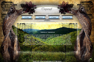
I gave my site named it as "Tropicraft", The concept Tropical reflects jungle/forest...as long it relates to wood, thought I like the perfect combination of the Tropic+raft. :p


This is my home page, the overall feelings of its layout that I'm most probably going to used as for the other 2 home layout(below) it just for an experiment purpose.
The concept of my layout inspired by 2advanced.com , the fact that I like its sci-fi mood. I did some minor montage(or maybe different technique) on different area such as the mountain, messed around with shadow, lighting, brush paint etc..to create a kinda fakey realistic scenery but at the same time it brings out the mood that I want.
My Home/page - experienced different style
-a gate opening to the world...erm Narnia..
My Home/page - experienced different style
-nothing much but a grey brick (tweaked) the whole outlook it gaves another feelings..

____________________________________________________________________

Tutorial
So here comes the Tutorial section where by I have 3 tuts to share my self-made-handicraft.
Flower blinko, tri-branch deco and key chain.
Contact
My contact section
Disclaimer
My disclaimer section

Monday, November 10, 2008

Saturday, November 08, 2008

Web Design - 2nd


Due to the virus hacked all my files 90% -_-( I meant everything[backupless]),really din't expected it...so here are another version of my art direction towards my interface,layout,nav etc.. In progress for refinement. En


Friday, November 07, 2008

Hell-oween' Shadow/Samurai/Skeleton


Typo project(Feel & Sense)-Shadow
My task was to come out an abstract typo by turning into something else(distort, whatever) in order to come out a sense of feeling by looking at the visual/graphic, though it must have logical sense behind the design itself.

Tuesday, October 28, 2008

html Website design (project-1)

Home
Bio
Project
Univerchine
Contact

My very first time I felt so bad for being shown nothin' on my presentation day(D-day), and I realized my mistake lor...so...get over it.

Web Design Project 1-Motorcycle Collector
My final outcome, took me age on html as well as design side...!! it was really pain in the ass at first cuz I realize there's Dreamweawer that can be done and of course basic html is the best way to start. Yea

Click below to view:
(teouregmails40univerchine)

WEBSITE DESIGN-PROJECT 1

Saturday, October 18, 2008

Flash ll


Title: Survival Guide
-how to survive from a giant squid attack !

Introduction
-what if one day you were so happen to be on a boat fishing alone, suddenly you realized a giant squid emerged and attack you, so what are you going to do ?!

Art Direction:
-Humorous , exaggerate

Art Style:
Vector/Artline

Interactive style:
Games/guide

- - - - - - - - - - - - -

Saturday, September 27, 2008

Mood Board for Web.D-P1

Motorcycle Collector

Wednesday, September 17, 2008

FlasH - Fly me to the Moon

Inspired by


Friday, May 30, 2008

Ribbon


Saturday, May 24, 2008

Flar3l3ments .ver1

Thursday, May 08, 2008

Imagination

Imagination